Crossword Bookstores At Kemps Corner, Mumbai Reopens With A Colourful Makeover
- 14 Apr '22
- 7:50 am by Nuriyah Johar
|
Getting your Trinity Audio player ready... |
When Crossword closed the doors to its flagship bookstore at Kemps Corner in September 2021, it felt like yet another battle lost to the overwhelming world of e-commerce, audiobooks, and Kindles. The blow felt personal to the generations that grew up reading within its aisles; Crossword was beloved, almost sacred. What made the closure especially significant was the fact that this was Crossword’s first-ever outlet, established 30 years ago before the brand proliferated across the country. Imagine our collective surprise and joy then, when the bookstore reopened with a bang! Crossword now sports an exciting new identity, yet retains the inherent essence of the bookstore we’ve once known and loved.
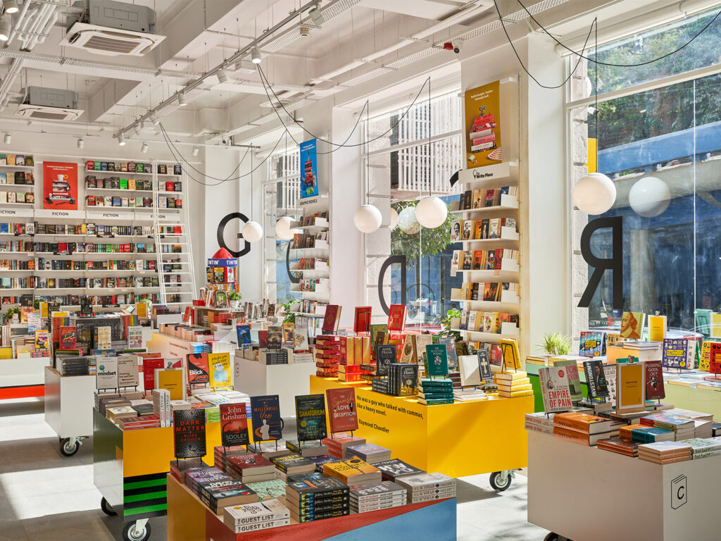
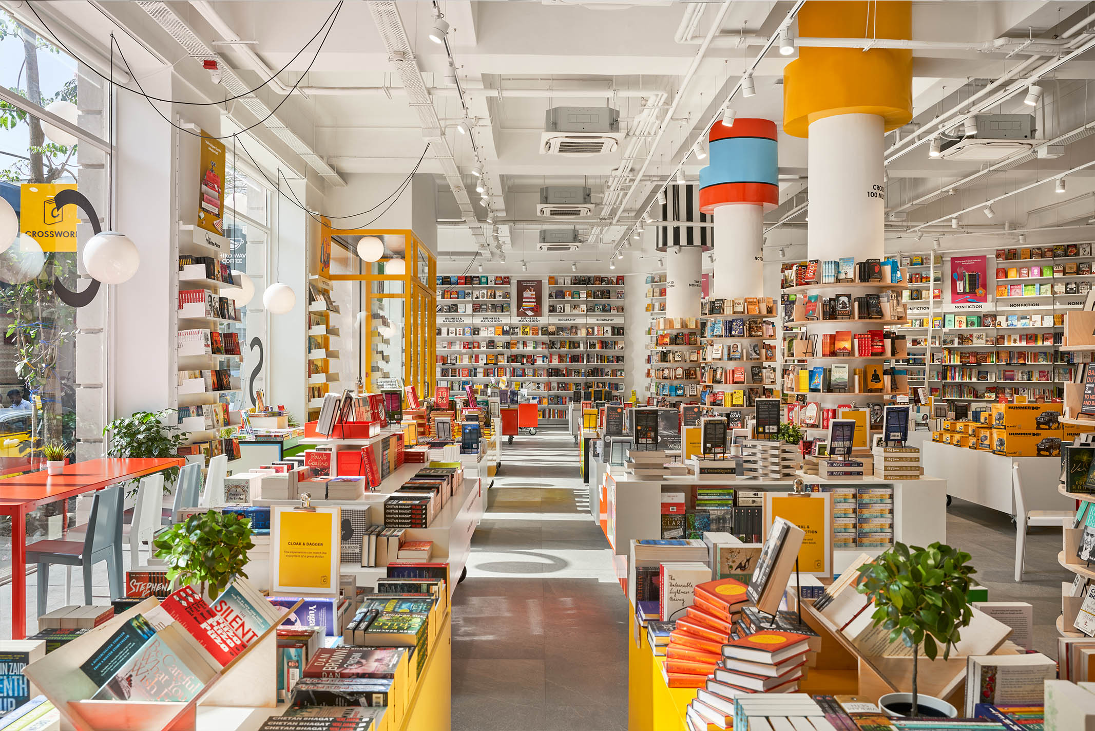
Refreshing white walls punctuated with bold splashes of colour, geometric forms, and movable display boxes – Crossword’s striking redesign is the work of Ajay Shah, who runs an eponymous design studio. His relationship with Crossword is hardly new; Shah has been retailing his stationery brand Rubberband at Crossword for many years now. “My connection with Crossword has been as a regular customer and as a seller. I am an ardent book reader and have always loved bookshops. Hence this was a dream project for me,” he says. His creative vision combined space, product, and graphic design seamlessly to give the bookstore a free spirited and individualistic personality. “The overall shop has a visual language that balances simplicity with an exuberant, expressive language. The colours bring life whereas the design becomes timeless,” Shah adds.
Not bound to any existing templates, Shah and his team (including Naomi Shah who conceptualized the graphics, and Maithili Shah, who helmed the visual merchandising) were encouraged to approach the project from a fresh perspective. This is clear in the layout of the new store, which is fairly different from the old one. “Like many others, Crossword at Kemps Corner is a shop that I have frequented many times,” Shah tells us. “I always felt that this store needs a design overhaul. The store had grown organically and whilst it grew in size and categories; the services and the basic shell did not cope up with the changes. In fact, changes were made overnight on the displays and other elements, and all of these had become quick fixes. My thought process was to provide a space that is more open, welcoming and adaptable”.
Once the existing space was opened up, Shah and his team decided that it was vital to let the store breathe, and make the most of the expansiveness that the structure afforded. This took the form of shelving that went up to twelve feet in height, an entrance with a defined landing point that became the transition space from the outside to the inside, and a spatial configuration that relied on portable units and not on partitions. This plan accounted for books to occupy all of the ground space, whereas the loft houses an outlet of Third Wave Coffee, alongside stationery, gifts, and toys.
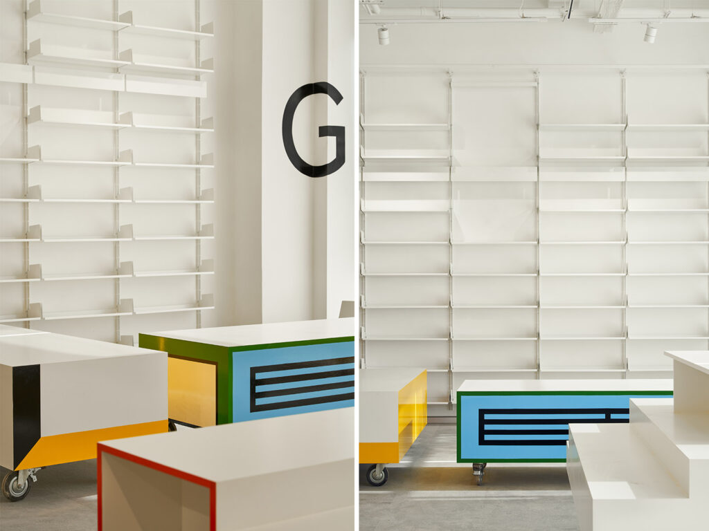
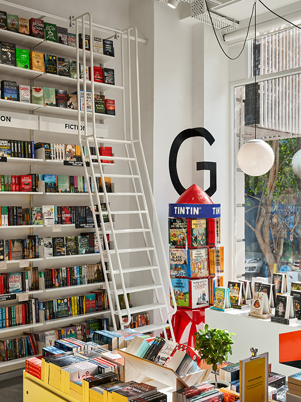
Given the nature of the project, one of the most important decisions in the design process was that of displaying the books. Shah and his team explored several forms ranging from tables to units, materials like light wood and metal, and tall structures that made the most of the ceiling height. The result? A bold, Mondrian-esque assortment of box-like display units with industrial wheels that can be moved or locked in place. Though these make a statement in their own right, for Shah, “the most compelling design element would have to be the tall 12 ft shelving system with a sliceable ladder.”
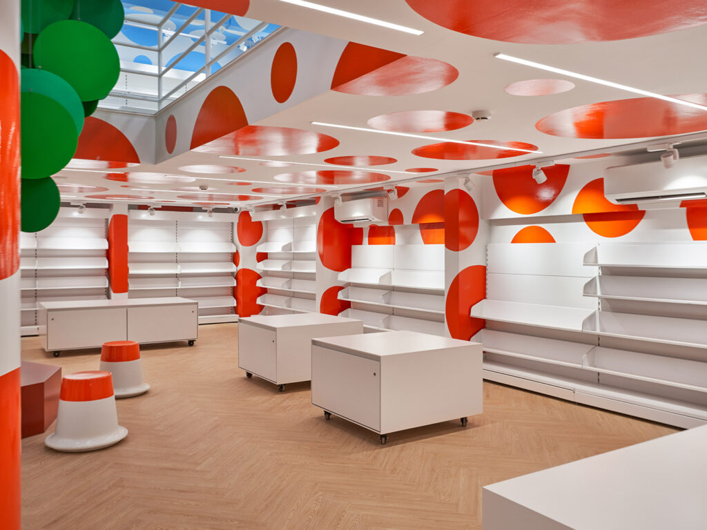
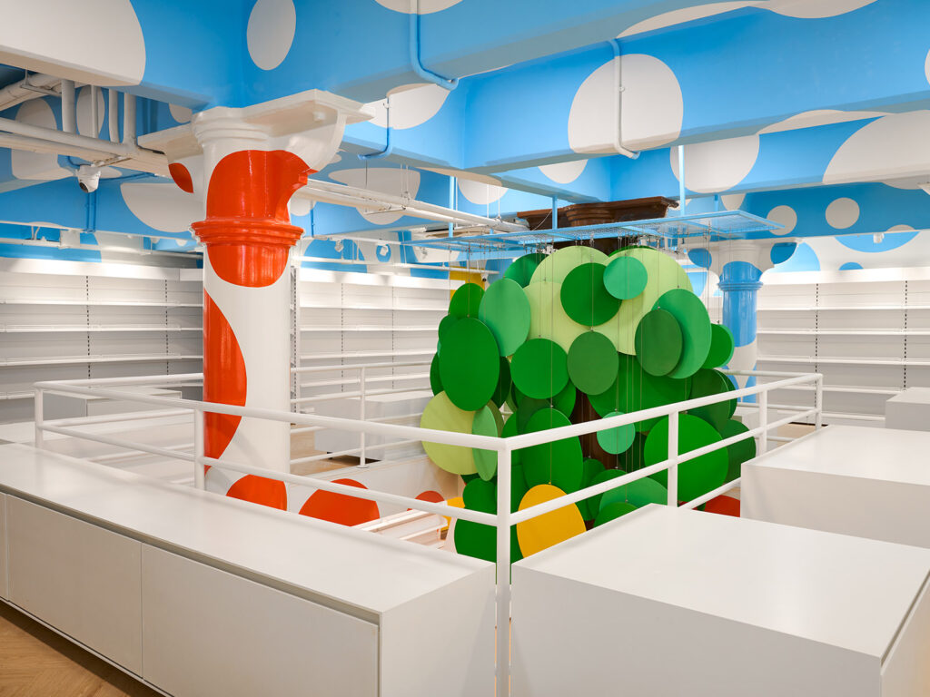
If the display boxes seem to reference Piet Mondrian, the children’s section, covered entirely in brightly coloured dots, appears to be influenced by the iconic style of Yayoi Kusama. “I was tasked to create a bit of stir, excitement, and warmth in the kid’s book area of an otherwise minimal bookstore. My response was to instantly fill the space with shape and colours. Ceilings, walls, beams, doors, columns, corners are all covered in three different diameters of dots,” says Niomi Shah. The dots are tightly spaced, gloss finished, and brightly coloured – infusing the space with whimsy and wonder without seeming overly childish. The children’s section also accounted for an idea that the owners were keen on – a tree around which there could be reading sessions. Shah’s reinterpretation of this tree is more abstract, made with circles in shades of green suspended from the ceiling (with a yellow circle adding the signature Crossword touch!)
This whirlwind project was executed in a hundred days. “The tight timelines were challenging, because we really had to move fast. However, we had a wonderful client who trusted us on the design and made this process smoother,” Shah concludes.