Jotun Paints Launches Jotun Canvas: A Comprehensive Colour Guide For Indian Homes
- 2 Apr '24
- 6:28 pm by Tanvee Abhyankar
Founded a century ago in Norway, Jotun is renowned for its comprehensive range of indoor and outdoor wall paints. With a legacy steeped in pioneering research and colour development, the brand is celebrated for the exquisite aesthetic appeal of its decorative paints. As the year unfolds amidst a flurry of trends and innovations in the colour industry, Jotun steps forward with an offering tailored explicitly for Indian interiors: Jotun Canvas 2024. This new palette presents Indian homeowners with an array of hues, empowering them to define their living spaces through self-expression.
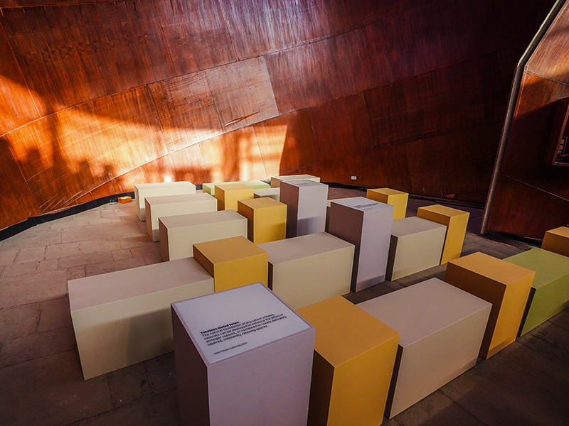
Each year, Lizbeth Larsen, Jotun‘s Global Color Manager, along with the company’s team of international colour specialists, examines global societal trends. By tapping into emerging cultural currents, Jotun skillfully translates these insights into a colour palette finely attuned to modern living. The resulting colour card– curated to spark creativity and personal expression within living spaces–introduces 23 captivating shades from Jotun’s extensive collection. Among these hues are 10 brand new additions, expertly crafted under Larsen’s guidance within Jotun’s state-of-the-art colour technology lab. To ensure perfection, each hand-picked colour undergoes rigorous testing on large walls, guaranteeing seamless integration into any space while adhering to prevailing global design trends, and promising enduring aesthetic appeal for every interior.
Also Read: DP Offline x Commune: The Chic Singaporean Furniture Brand Unveils Their Flagship Store In India
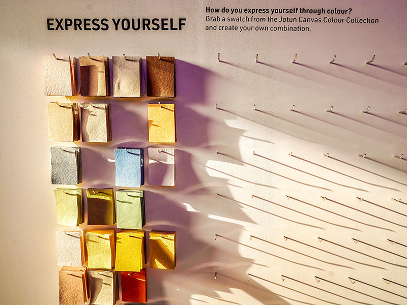
In response to the burgeoning global demand for tranquillity and centring hues conducive to relaxation, Jotun‘s 2024 palette emerges with a diverse array of shades meticulously curated to evoke a sense of calm and harmony. Drawing inspiration from nature’s serene landscapes, the palette features a spectrum of verdant greens, alongside refreshing blues and gentle greys reminiscent of the tranquil hues of the sky and sea. Rich earthy browns and soothing beiges impart a grounding effect, while vibrant yellows and golden tones infuse spaces with an uplifting aura of joy. Grounded in the pulse of contemporary trends sweeping the globe, Jotun‘s selection process focuses on transforming these trends into wall-worthy colours that cater to diverse tastes and preferences. Each colour name is thoughtfully chosen to either reflect the hue itself or convey the emotional impact it embodies, offering customers a clear understanding and a deeper connection to their chosen palette. Within the colour card, one discovers a myriad of unique shades accompanied by equally intriguing names. Examples include “Soothing Beige,” “Comfort Grey,” “Healing Lavender,” and “Mindful Green,” which are designed to evoke specific feelings or experiences. In contrast, names like “Pistachio,” “Rock Sugar,” “Green Tea,” and “Fresh Pasta” describe colours through universally recognized food associations.
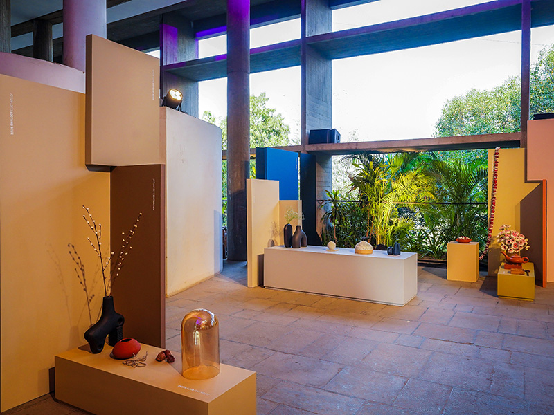
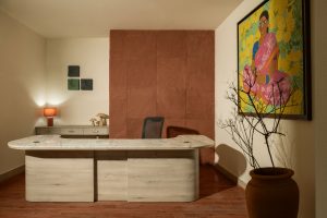
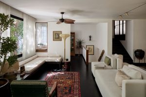
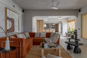
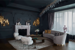
Larsen understands the importance of colours as a medium of expression and says, “When it comes to expressing ourselves, colour is the most powerful tool we have. Even if we don’t always realise it, all of us are brimming with ideas. Sometimes we just need to find the courage to express them. Canvas is Jotun’s way of giving people that courage; of showing them that, deep down, everyone can be an artist.” In a nation where colour permeates every facet of daily existence, Canvas by Jotun extends an opportunity for self-expression, inviting each Indian homeowner to craft their living spaces into personalised masterpieces with colour combinations tailored specifically for Indian homes. These recommendations are vividly illustrated through captivating interior photography, breathing life into the transformative potential of each chosen hue. Rana Khadra, the Regional Colour and Communications Manager for the Middle East, India, and Africa, conveyed that this year’s launch revolves around encouraging the artist within oneself. It involves embracing the release of creativity and expressing it in a colourful world that reflects personal identity through visual means.
Also Read: Witness Innovation In Illumination At Innovative Design Studio
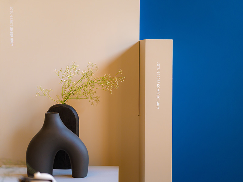
When asked about Jotun’s goal for creating Canvas, Mr Ashish Nimbark, Sales & Marketing Director – Decorative at Jotun, expressed that colours hold a crucial role in influencing the atmosphere and emotions within one’s surroundings. He emphasised Jotun‘s commitment to recognizing this importance by providing a wide range of colours that align with individual tastes and subtleties. Through diligent research and development, the aim is not only to impact but also to elevate individuals’ decisions in selecting colours, empowering them to establish environments that genuinely mirror their distinct personalities and lifestyles. Grounded in the timeless principles of colour theory that have guided artists and interior designers for generations, the Canvas shade card by Jotun offers a comprehensive guide with a convenient colour-wheel graphic, empowering readers to grasp the rationale behind the selected hues and understand the featured colour combinations with ease. Jotun has transformed the shade card into an educational tool, introducing four matching theories to simplify colour combining. From the monochromatic theory, which explores variations of a single hue to create depth and cohesion, to the utilisation of adjacent, complementary, and neutral colours, Jotun provides homeowners with the knowledge and confidence to navigate the intricate realm of colour harmonisation effortlessly.

