The New Indian Workplace Is Futuristic, Immersive And Full Of Character
With designers rewriting the workplace playbook in India, many are ditching corporate convention to embrace materiality, colour and brand identity that put creativity firmly centre stage.
- 23 Sep '26
- 12:09 pm by Beverly Pereira

What does the office of the future look like? Across India, workplaces are beginning to rethink the very idea of what an office should be, replacing rigid layouts and predictable aesthetics with spaces that are fluid, immersive, tactile, and deeply connected to the people who use them. The result is a new kind of futurism, one that is less about predicting tomorrow and more about responding to how we work today.
In these three offices in Mumbai, Chennai and Kerala, the departure from the cookie-cutter workplace happens through material experimentation and a human-centric approach to how people occupy space and contribute to the creative process. While one workplace deconstructs a sewing kit as inspiration for its interiors, another turns a tiny office into an immersive design experience, and still another quite literally plays with light and Mumbai’s skyline.
Also Read: #DP Exclusive: Experience Immersive Architecture Rooted In Sustainability At This Office
Mirages Azul by HSC Designs
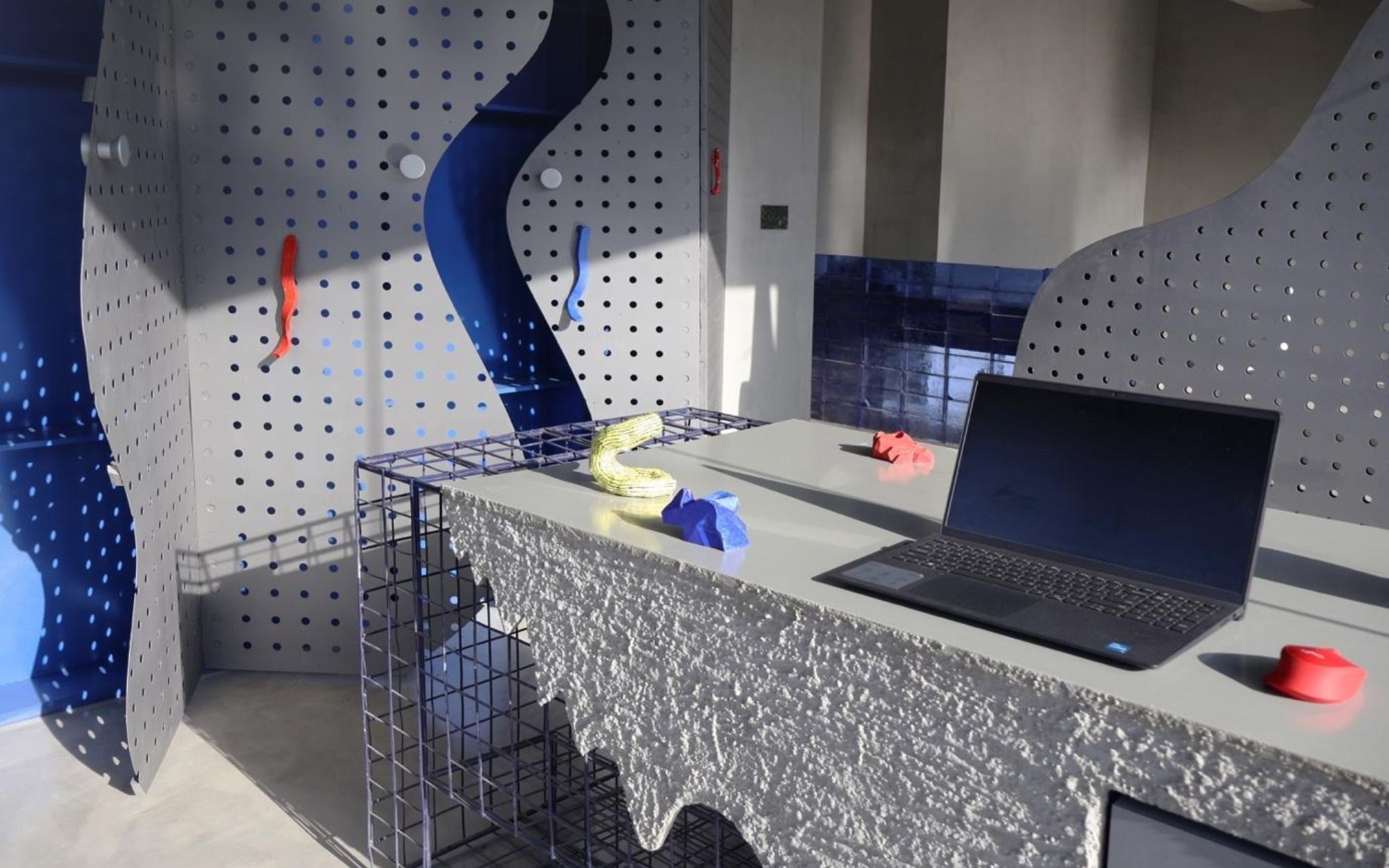
At just 550 sq ft, Mirages Azul, an avant-garde, futuristic office located at Poes Garden in Chennai, takes a compact footprint and transforms it into a study in form, reflection, the generous use of blue, and the boundless nature of creativity. The workplace was designed by HSC Designs, known for its research-driven, user-centric philosophy. Mirages Azul, a young spatial and experiential design start-up, works at the intersection of design, experiences and storytelling. Yet, this unconventionally small workplace completed in 2024 rejects every opportunity to behave as if it lacks in space. Designed as an extension of the brand’s visual identity and as a setting for the client’s aesthetic exploration, the office oozes intentional symbolism. Despite the fact that it enjoys no such luxury of sprawling workstations and breakout zones, the workplace mirrors the start-up and its visual identity, thanks to the generous use of blue. Further, reflective metal panels work in tandem to form a ceiling that appears to shift and move. “Instead of treating the branding graphically, we wanted it to become spatial. The result is a workplace where the brand is experienced rather than simply displayed. We approached this project almost like an immersive installation rather than a conventional corporate interior,” says Hiloni Sutaria, founder and principal architect, HSC Designs, known for its research-driven, user-centric philosophy.
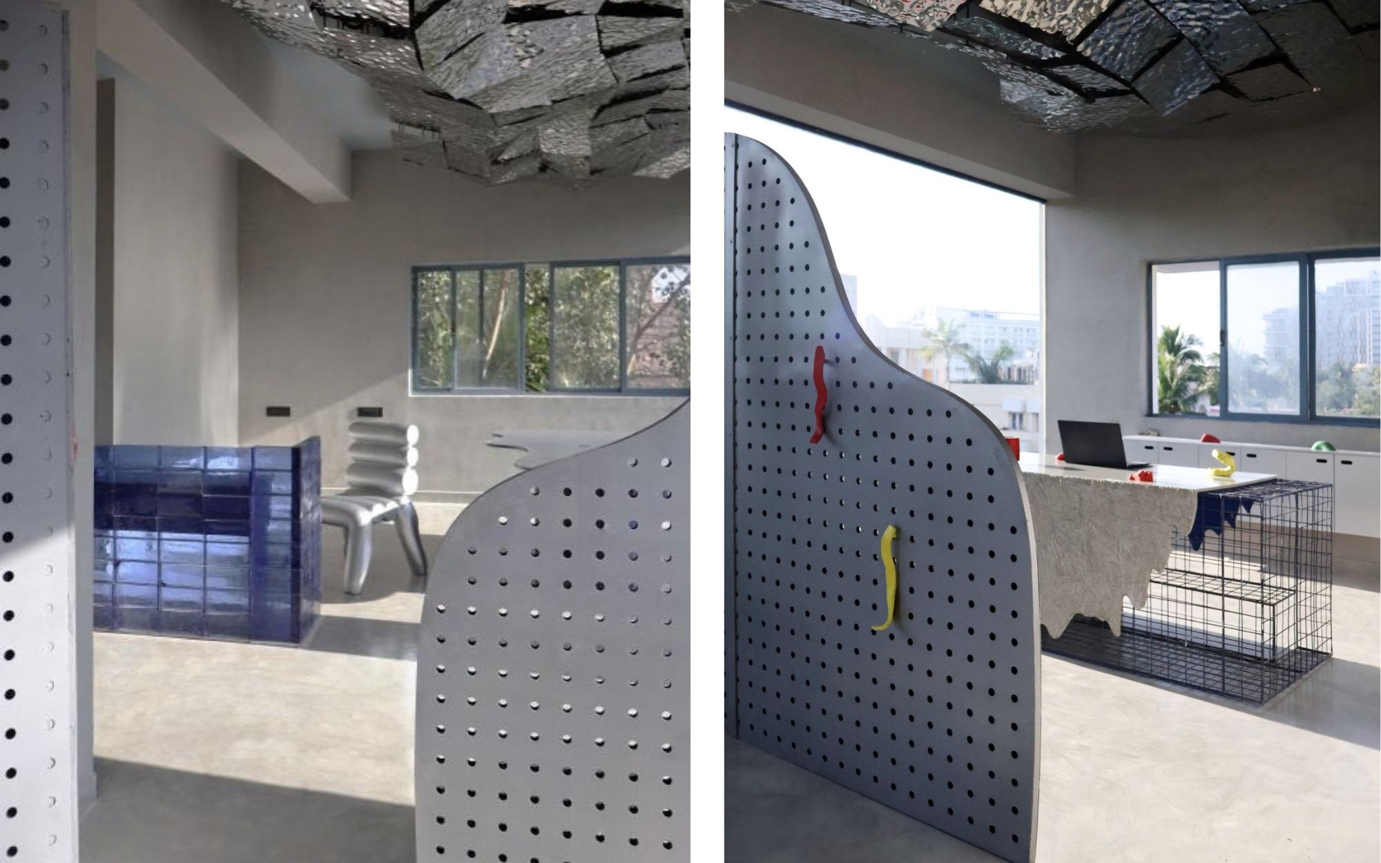
Micro concrete floors, muted walls and exposed industrial textures provide a quiet backdrop for a series of sculptural interventions to crop up. In the Mirages Azul office, pieces of furniture are treated with whimsical touches, even as its most obvious design intervention sits overhead. A chair formed from cylindrical metallic tubes reads almost like an object from the future, while a fluid, organically shaped desk ushers in a softer, more kinetic geometry. Its deep-blue glass base brings colour, translucence and reflection. Above it all, fragmented mirrored-metal panels are arranged in a jagged manner to form a reflective ceiling, scattering light across the room, lending the compact workplace a distinctly atmospheric quality. “As people move, daylight changes and activities happen underneath, the ceiling captures fragments of all of it. So, the perception of the space is never completely static. There is also an interesting contradiction in the material itself. The metal is visually fluid because of reflection, but physically it is quite rigid and difficult to manipulate,” Sutaria explains. The designer adds that an important part of the process involved working through iterations to arrive at an understanding of how the individual pieces could be fabricated, positioned and assembled to create something that appeared much more fluid than the material naturally wanted to be. A glossy sapphire-blue glass-block partition not only catches and reflects light, but also provides a saturated vertical counterpoint that grounds the ceiling and its fragmented charm. Rather than simply treating the workplace as a run-of-the-mill vessel for productivity, Mirages Azul positions the interior of its Chennai office as an active part of the studio’s creative process. “Figuratively, we liked the idea that a creative workplace could quite literally reflect the creativity happening underneath it. You have this continuous dialogue between opposites: raw and polished, rigid and fluid, opaque and transparent, neutral and intensely coloured, industrial and almost futuristic,” says Sutaria, who believes that people exchange ideas when they are stimulated, feel comfortable enough to experiment and when their environment gives them something to react to.
Doreme by Spaces and Design
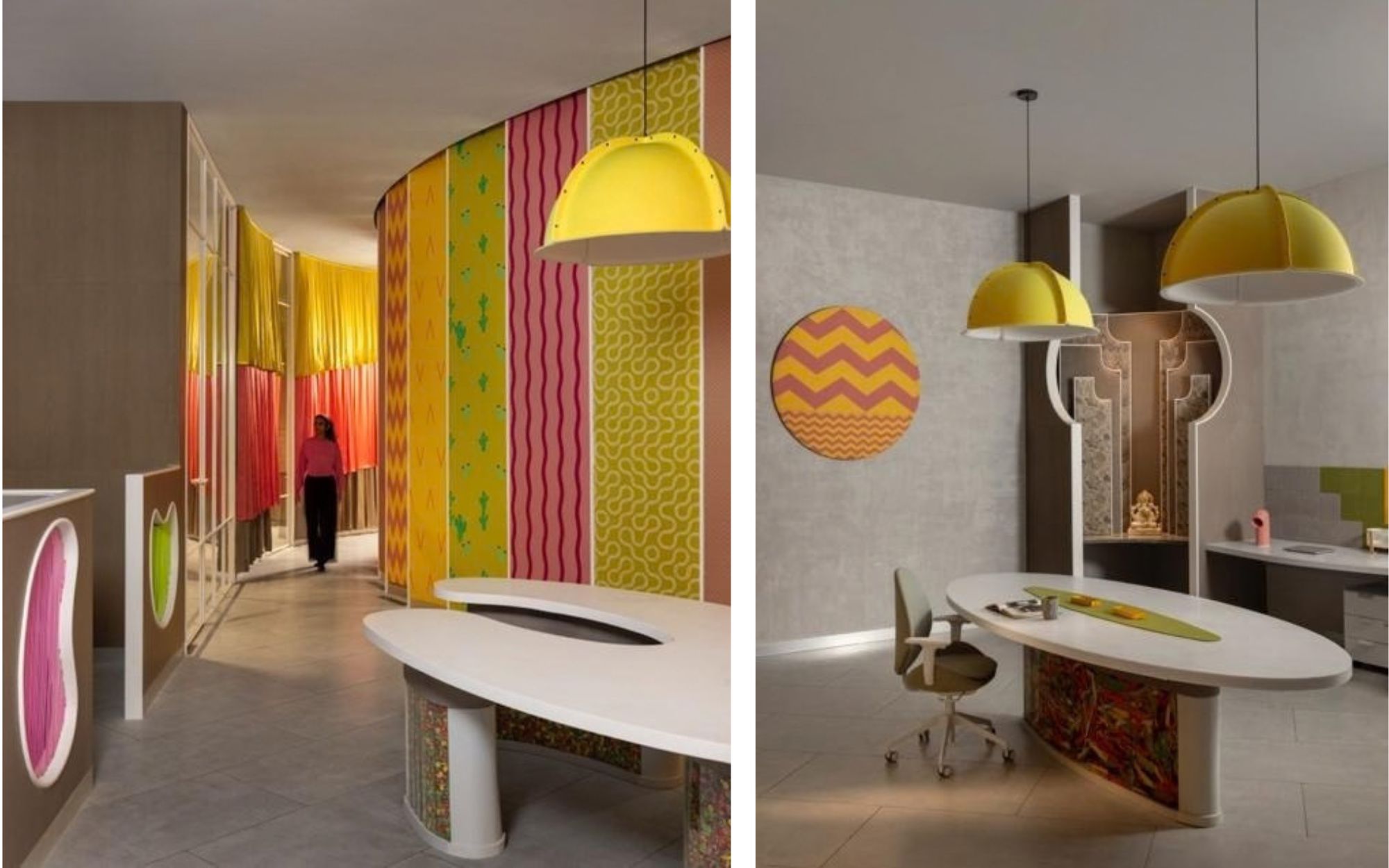
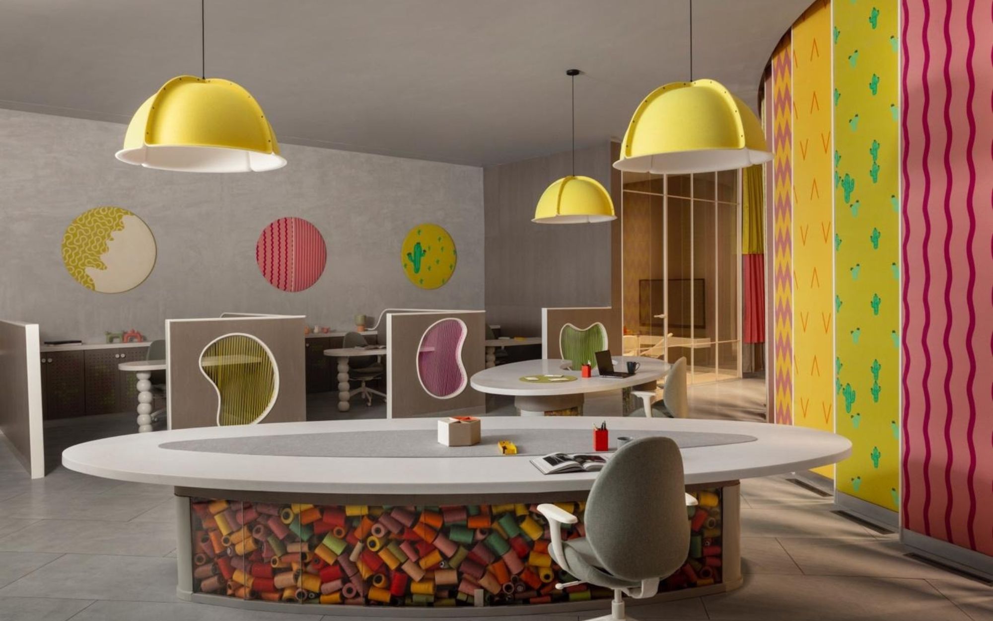
For its new headquarters in Kolkata, children’s apparel brand Doreme from the Northeast of India opted for the visual language of garment-making and sustainability as the guiding principle of its interiors. The Doreme office skirts a new retail showroom, both of which were designed by Pooja Bihani, principal architect and founder of Spaces and Design. Using every inch of a former warehouse, the Doreme workplace harnesses its generous volume to accommodate private cabins, a meeting room and pantry, workstations, a merchandising room, and the managing director’s office. The team drew from the brand’s own materials to craft clever design details in the showroom that spills into the office, creating an atmosphere evocative of a giant high fashion sewing kit. A stand-out feature is the minimal use of doors and visual barriers for a palpable sense of openness. Here, threads are transformed into partitions, effectively doing away with conventional solid partitions. Transition spaces are layered with curtain panels that mimic the drape of a garment and the functional beauty of folds. Another reference to tailoring arrived by way of floor-to-ceiling panels with playful prints that infuse circulation areas with colour, texture and pattern while allowing light and movement to pass through.
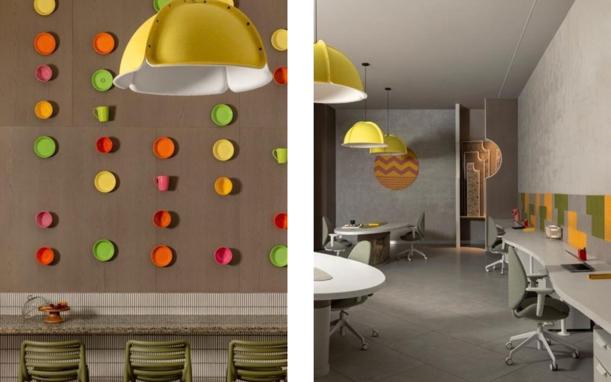
Against cemented-texture finish walls and grey tiled flooring, the Doreme workplace carries forward the showroom’s overarching concept of neon greens, pinks, oranges and yellows—a palette reflective of how children naturally respond to colour and energy. Oversized buttons replace conventional handles, and tailoring details inform pieces of furniture. Half-height desk partitions were framed and laced with neon strings, referencing craft and weaving, while storage units feature perforated faces arranged in cross-stitch patterns. Workstations and tables are supported by transparent glass bases filled with colourful buttons, zippers and yarn sourced from Doreme’s production materials and colour sorted on-site to fit the palette. At Doreme India’s new workspace, what might have remained hidden within the production process has effectively been brought into view. “We didn’t want the office to simply display the brand, but to embody how the brand thinks and makes. By pulling from threads, buttons, zippers and fabric folds, the workspace becomes a physical extension of the design process itself, so employees are surrounded by the same craft language they work with every day. This blurs the line between a “corporate” environment and a creative studio — people don’t just sit at desks; they sit inside the brand’s material world,” says Bihani, adding that office design needs to be authentic to what the company makes and values, and that authenticity is what turns a workplace into a space for genuine creative exchange.
Also Read: On Paper: Indian Artists Who Transcend The Medium
Fast Flick Productions by Studio Pomegranate
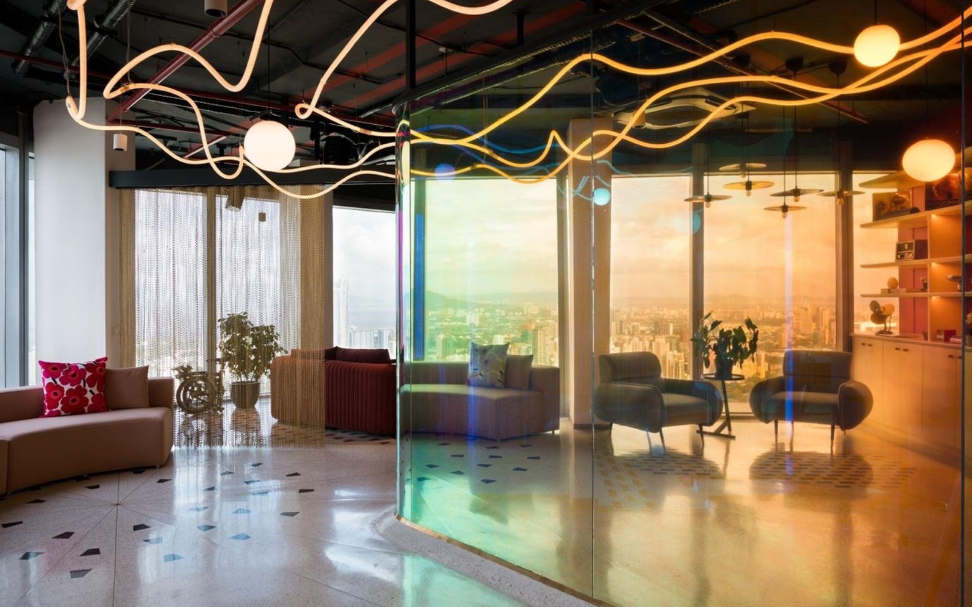
At a corner office 44 floors above Mumbai at Dadar’s Kohinoor Square sits Fast Flick Productions, a growing player in Punjab’s music video production scene. Instead of competing with the city views outside, the office uses Mumbai’s vibrant skyline and the changing quality of light as part of its design. Designed by Studio Pomegranate with a vision for a workplace that feels far removed from the conventions of corporate offices, the project arrived with no cues for a brief. To this end, Shweta Shah and Pranav Naik, co-founders and principal architects at Studio Pomegranate, took it upon themselves to figure out the direction of the studio design, while also introducing the client to the cultural and visual language of Mumbai. Rather than a predictable sequence of cabins, desks and corridors, the workspace follows a deliberately non-linear approach to design, moving through spaces with a sense of visual continuity. Further, the angular floor plan and floor-to-ceiling windows allow for constant views of the city—features that gently nudge movement between social and private zones. “In essence, the guidance happened through contextual education, site-specific design decisions, local materiality, and a spatial strategy that fused Mumbai’s urban character with the client’s creative industry energy,” say the designers. The project marks a departure from Studio Pomegranate’s otherwise restrained, earthy aesthetic.
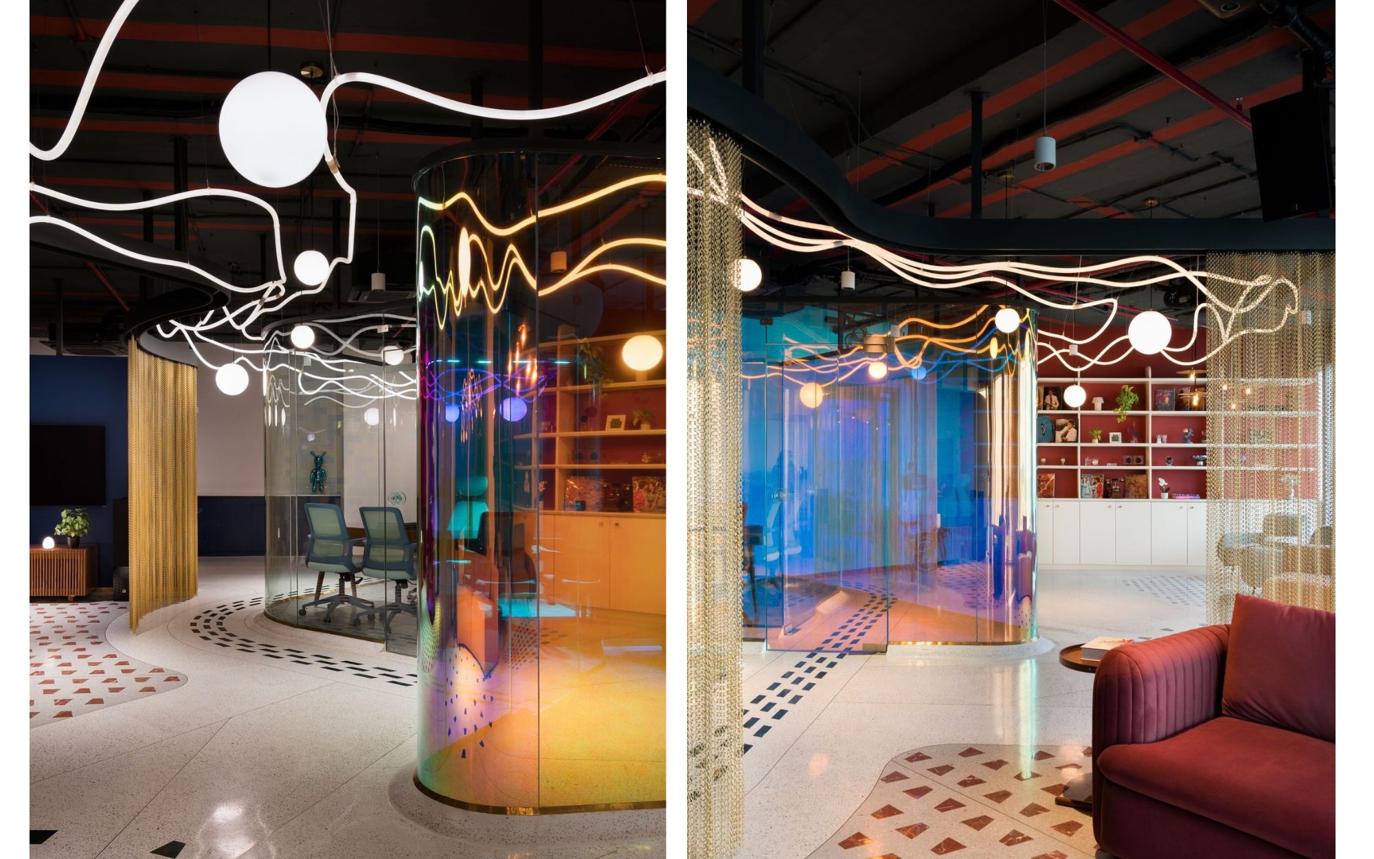
Dichroic glass used for the outer cabins offers privacy without becoming just another office partition; the material also catches the changing light of day, drenching the interiors in colour. The palpable cinematic atmosphere is deliberately dynamic, recalling the saturated visual language of music videos. Underfoot, in situ terrazzo, a material associated with Mumbai’s architectural history, anchors the otherwise contemporary interventions across this office. “The material palette in the office is intentionally selective and expressive, balancing local identity, industry energy, and functional performance. We chose a material-driven spatial experience using glass, dichroic film and metal chains. Together, these choices ensure the office isn’t just an inert space but a flexible, stimulating environment that supports varied work patterns and evolving creative needs,” say the designers. The material-focused approach in this office deliberately turns the corporate environment into a catalyst for creative exchange by making the space itself a dynamic participant in the work process, they add. Ultimately, colour, light and geometry work in tandem to create a workplace that is both functional and expressive.