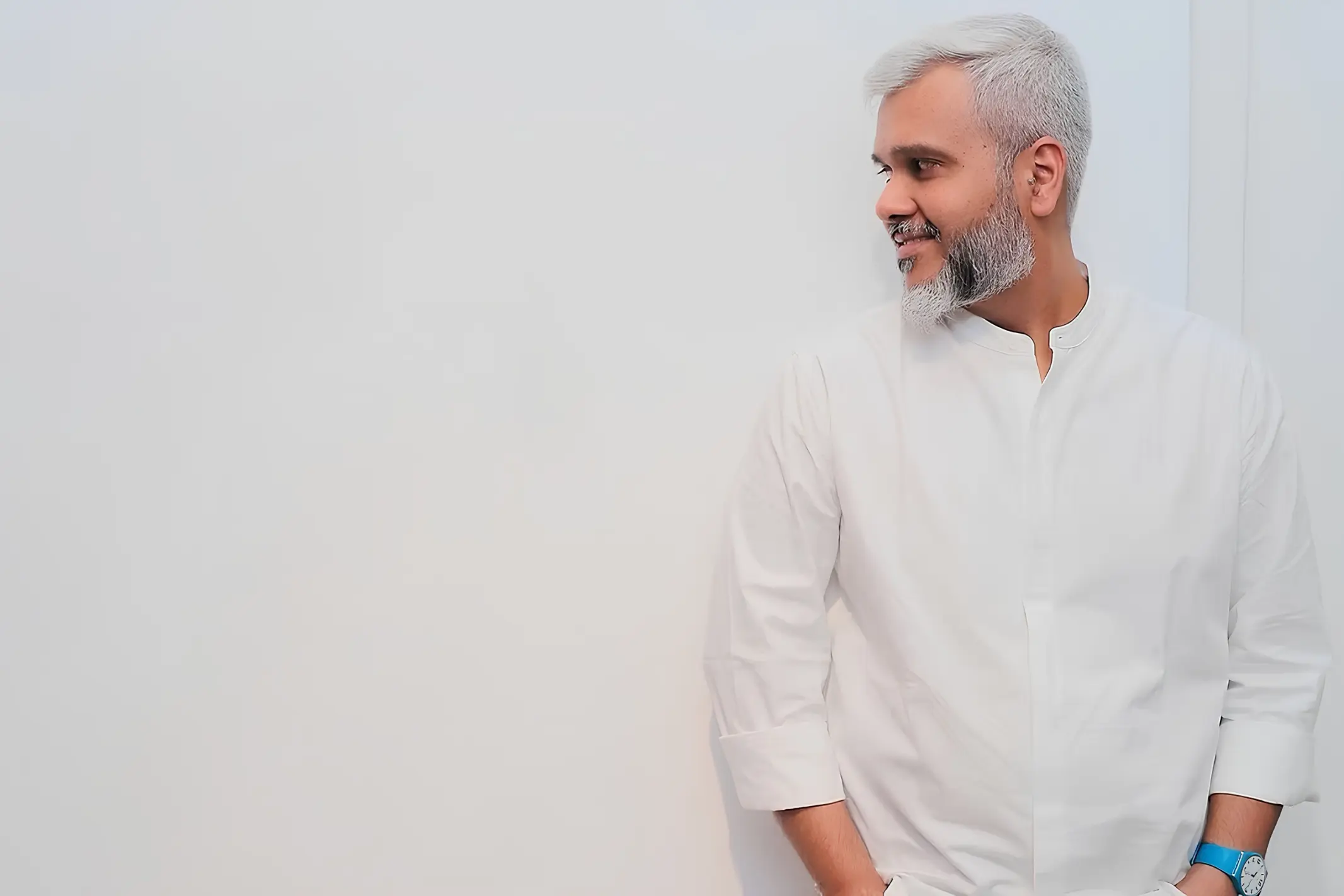
With The Artist: Nikheel Aphale On Why The Devanagari Letters Feels Democratic And Inclusive
Known for metamorphosing the Devanagari script, Bangalore-based artist Nikheel Aphale is giving traditional scripts a flamboyantly contemporary afterlife.
- 1 Jun '26
- 12:01 pm by Simran Almeida
|
Getting your Trinity Audio player ready... |
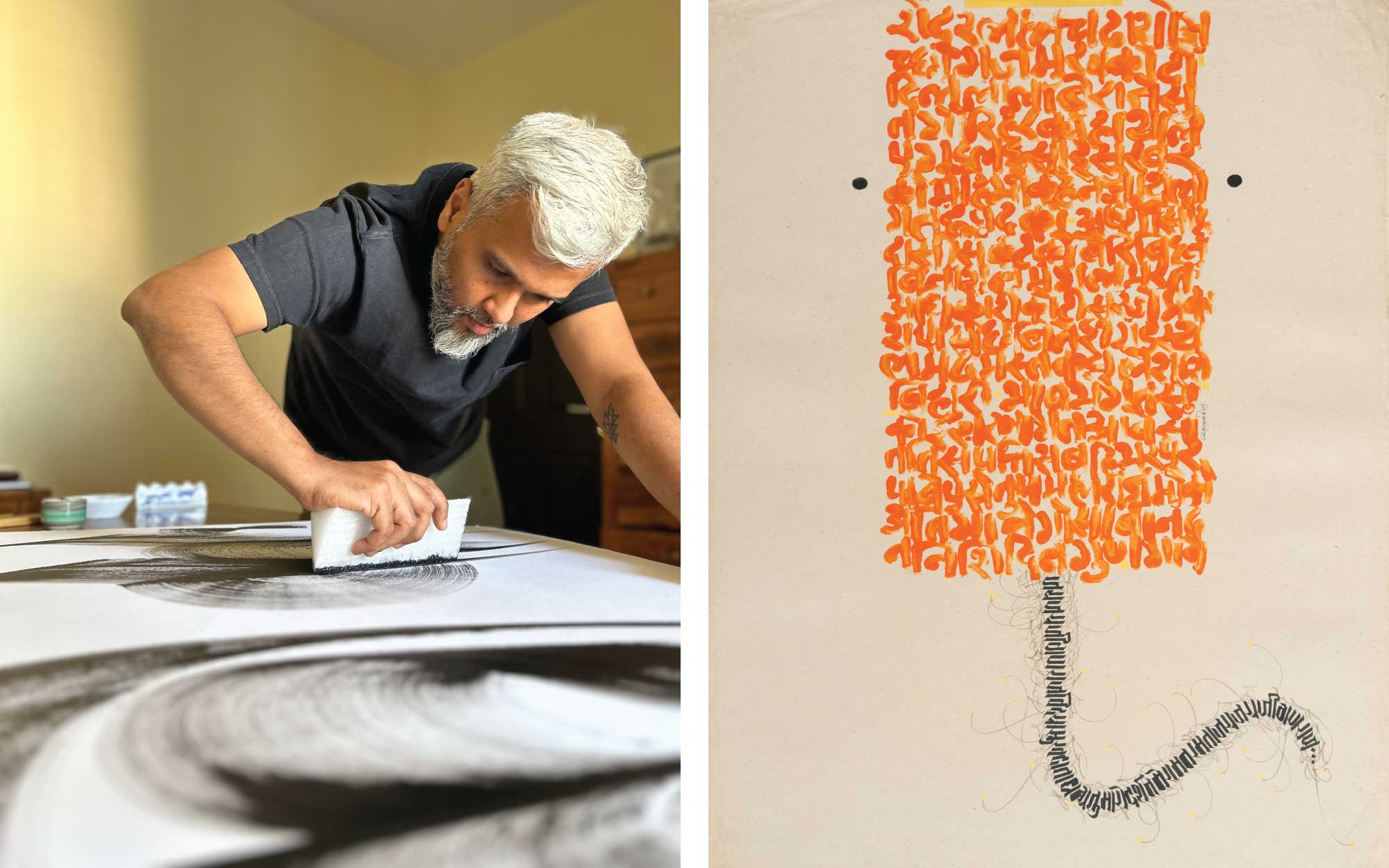
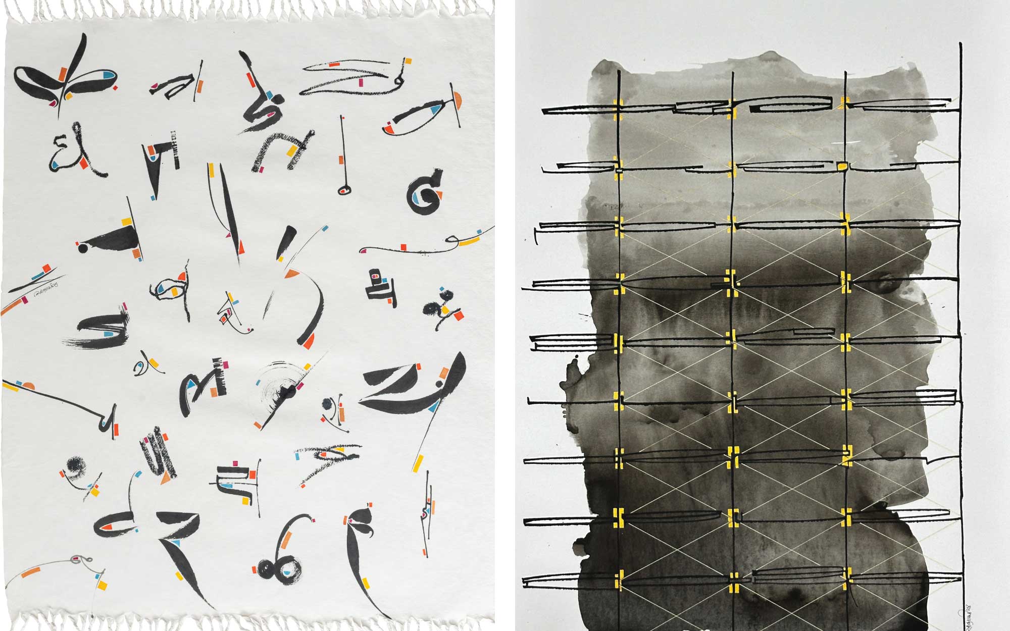
Garish, flamboyant and brimming with theatricity, Bollywood movie posters have always painted the city’s streets, especially in Bombay. Be it a white wall on a narrow street or a colossal billboard on the highway, the posters and their multifarious fonts were a scripted muse for the Mumbai-born calligraphy artist Nikheel Aphale in his nascent years. Endowed with impeccable penmanship from his mother and attuned to scripts beyond English, especially his mother tongue—Marathi—Aphale’s artworks ripple and extend the ‘Devanagari’ script to tell tales of mythology, identity and collective cultural experiences. When he began lettering in 2006, little did he know that his debut solo exhibition, ‘Sacred Strokes,’ would sell out within six hours and his works would be a part of the permanent exhibit in India’s new Parliament Building. I noticed his effortless strokes at the workshop at Design Pataki’s Design Salon, Bengaluru, where he conjured a sense of nostalgia for working with one’s hands.
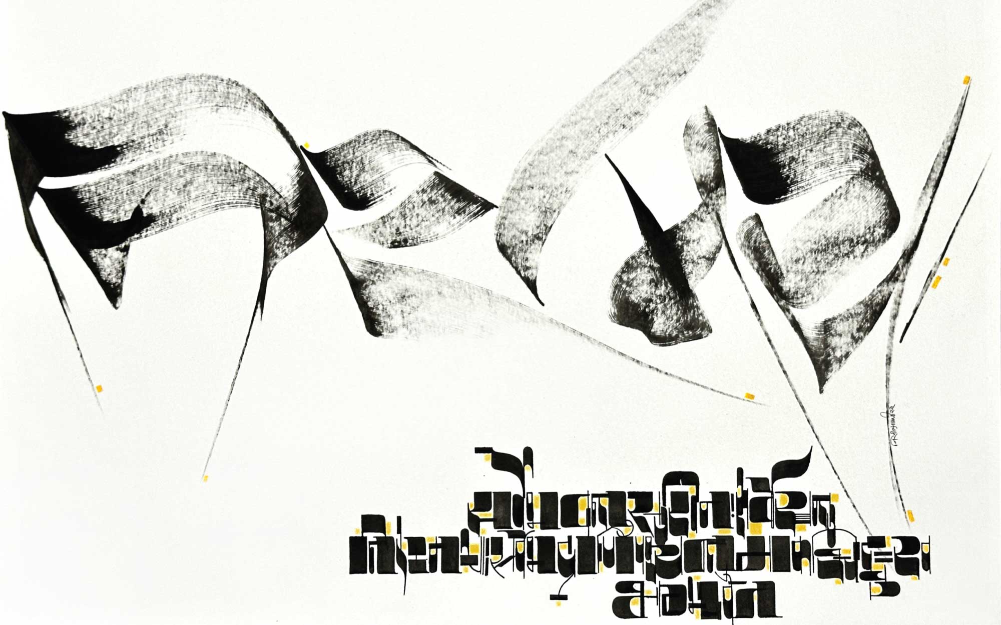
Aphale trained under mentors, whetting his obsession for alphabets, all while thinking about salvaging the ancient identity and roots of the Devanagari script. Recently, he staged a solo exhibition titled ‘Aksharscape’ at Bikaner House, Delhi, where his piece ‘Liberation’ envisages the idea of breaking free with the word ‘Nirmaya,’ (free from illness). Rendered in almost diaphanous strokes, the words seem to move in a hypnotic, trance-like fluidity, while at the bottom, a mantra pays homage to the ancient expedition of emerging from darkness. With works presented at various international fairs like the World Calligraphy Biennale, Auroville Art Residency and the Asian Calligraphy Festival, he has underscored how the ancient script travels like an expat, rooted yet borderless. He was conferred the ‘Excellence in Calligraphy’ award at the Jikji International Calligraphy Exhibition in South Korea for forging parallels between contemporary art and ancient manuscripts with Devanagari script.
Design Pataki sits down with Nikheel Apahale, with a pen and paper to trace every curve of artist evolution—from his efforts to preserve traditional scripts and his vision with Leehkin, his multidisciplinary practice, to material experimentation.
Also Read: Art Confidential: Abhinit Khanna On Playing The Long Game When Collecting
Design Pataki: Walk us through your work displayed inside India’s new Parliament Building. What was the starting point for it?
Nikheel Aphale: I created an artwork on the theme of ‘Gyan’ as part of an installation, where varied Indian scripts are presented through varied art forms. It celebrates literary traditions and wisdom, reconnecting us with our roots through the idea of ‘Gyan.’ My paper-based artwork uses a Sanskrit Subhashita conveying that the wealth of knowledge is the greatest wealth of all, with examples from everyday life. I have used the Devanagari script in a contemporary style to make it relevant to present-day audiences. It is reassuring to see calligraphy receive such a prominent platform where the diversity of Indian scripts has been showcased. Ultimately, language is the soul of our cultural identity. I feel honoured that my work has contributed, even in a small way, to this larger narrative.
DP: How has your Indian heritage informed your approach to translating Devanagari script into a modern visual language?
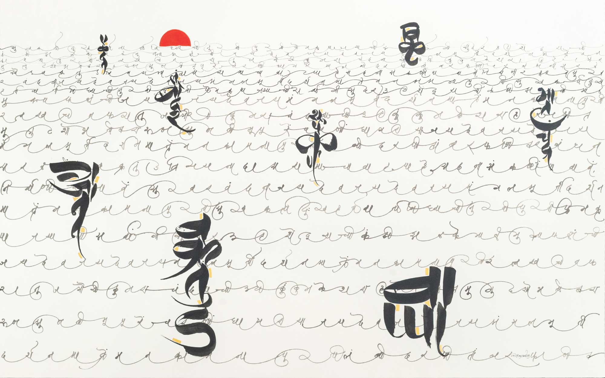
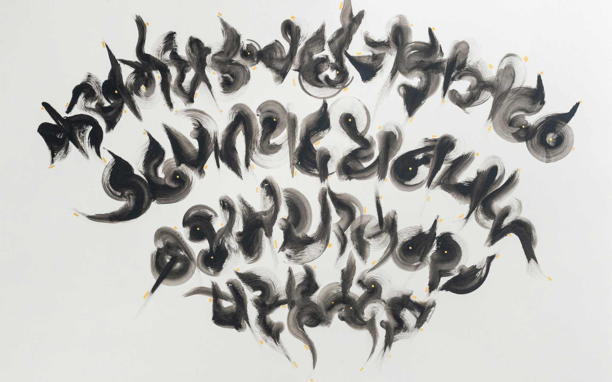
NA: Divinity, spirituality, and humanity are the primary themes of my work, while memories, stories, and reflections often find their way into my art. I use Devanagari letterforms to explore these concepts, where unbiased letters function cohesively to create a beautiful language and culture. Elements like ‘Barahkhadi’ (vowel variants) suggest togetherness, and the absence of case distinctions symbolise equality and inclusivity; no silent letters suggest voice for all. These inherent qualities of the script inspire me. Everyday life examples such as wedding processions, scaffolding, bouquets, and orchestras become part of my visual narratives. This approach allows the script to move beyond its conventional role, while carrying forward its identity and heritage and allowing it to evolve within today’s visual culture.
Also Read: From Picasso To Anish Kapoor: 3 Luxury Hotels That Bring Art To Life
DP: Calligraphy is such a distinct medium. What drew you to it as a form of artistic expression?
NA: Making calligraphy a professional practice or choosing it as an artistic path was never a conscious decision; I was drawn towards it organically. However, I was fortunate to inherit beautiful handwriting from my mother. Later, studying subjects like typography and calligraphy in art college introduced me to tools and different script styles, including Devanagari. I was fascinated by the idea of expressing emotions through letters without using any illustrations or images. Beyond this, the title lettering of Marathi plays and Hindi films, along with hand-painted signboards, sparked my early obsession with letters. Thereafter, exposure to international calligraphy and learning under renowned text artist Brody Neuenschwander determined me to pursue Devanagari as an artistic medium.
These influences have subconsciously instilled in me a fondness for creating letterforms which foster a lasting connection with the world of calligraphy.
If you had to work with one script other than Devanagari, which would it be?
Bengali
Which city inspires your calligraphy the most?
Mumbai
One tool you can’t create without?
Brush
Also Read: Art, Tech, & A Bottle Of Coke: In Conversation With Jayesh Sachdev
DP: How do you approach every piece; do you start with a concept and then arrive at the letters?
NA: My approach varies depending on the subject; sometimes it requires extensive research, while at other times it demands numerous warm-ups and text experiments. Primarily, the subject and the client’s brief dictate the vibe, mood, and shape of the letters, which in turn guide the choice of tools and medium. While working on the actual piece, several components like mind, hand, posture, the viscosity of ink, balance of white space and the surface determine whether a piece is complete.
DP: With pieces in Parliament and even in affluent homes, how do you adapt your script to different institutional or brand contexts without losing its soul?
NA: It is exciting and challenging for me, as an artist, to adapt this beautiful art form within a specific context and a set brief. I enjoy walking on the fine line between personal expression and commercial practice. The starting point is always to understand the ethos, history, and intent of the brand or institution. That becomes the framework through which letterforms express a brand’s personality. For the 40th anniversary logo for The Leela Hotels, I aligned closely with the brand’s philosophy, aiming to convey sophistication, legacy, and luxury through the quality of the strokes and overall composition.
“I see letterforms as inherently flexible, capable of adapting and shifting their character according to context. They can move fluidly across media, from graphic design and book covers to textiles, fashion, art, and sculpture. Ultimately, it is about translating the essence into a voice that suits its setting without losing its core spirit.”
DP: The Jikji International Calligraphy Exhibition often celebrates international calligraphers using script to bridge cultures. What did receiving the ‘Excellence in Calligraphy’ award there mean to you and your practice?
NA: I am honoured to see our Indian scripts being appreciated on such prestigious international platforms. This recognition became an introduction to our culture and heritage, moving beyond conventional perceptions of Devanagari. The audience who are unfamiliar with the language or script perceive the work solely as a visual form, responding to it as an abstract piece of art. The beauty of its form, gestures, flow of strokes, and the rhythm within the composition evoke emotional responses, allowing them to connect with the art intuitively. It becomes a fascinating experience, blurring boundaries.
Also Read: The Most Colourful Public Art Installations Perched At The Edge Of The World
DP: Which unconventional tools do you work with, and how do they influence your art of mark-making?
NA: The choice of a tool for a work is purely based on the subject. The concept decides not only the artwork’s tone but also the lettering form. I work with both traditional and unconventional tools, reed and dip pens, ruling pens, and brushes, alongside everyday objects such as toothbrushes, scrubbers, coconut husks, or even discarded bank cards. Each tool works differently, offering its own textures, flow, and expressive potential. For instance, if I want to convey a sense of ‘force’, I might choose a tool that is edgy and rough, like a toothbrush or a coconut husk to draw rather than a dip pen. A flat-nib dip pen has its limitations in expressing agitation, whereas the coarse irregularity of unconventional tools can communicate force and vigour more effectively. On the other hand, I would use a dip pen for a subject related to elegance, tradition or history, where control and refinement are essential.
What interests you more: the history behind a script or its future possibilities?
Future possibilities
One material you want to explore next?
Ceramic
One rule of calligraphy you keep breaking?
Making letters readable
DP: By reinterpreting traditional scripts in contemporary design, what cultural gap are you hoping to bridge?
NA: In today’s increasingly connected world, we often risk losing touch with our roots and the values that shape our identity. I want my work to become a bridge that connects people with their roots, bridging the gap between heritage and the present, between tradition and contemporary culture. I believe scripts embody memory, philosophy, identity, and collective cultural experiences. By placing them in contemporary contexts, I hope to make them accessible and relevant to newer generations and global audiences who may not necessarily understand the language.
DP: In bringing traditional scripts into modern applications, how do you imagine their role in the future of design?
Traditional art forms hold immense potential to be used across diverse creative domains of art, design, craft, technology, etc. In the context of calligraphy and script, their applications extend from graphic design–branding, logos, packaging, and event promotions to designing typefaces as well as disciplines like textiles, ceramics, and beyond.
Diversity is one of India’s greatest strengths and defining characteristics. We are blessed with a wealth of beautiful scripts, and the creative possibilities they offer are limitless. This richness can build into a distinctive and compelling visual language that is uniquely Indian.
DP: In an increasingly digital world, do you think the return to analogue reflects a broader appreciation for handcrafted work?
NA: In an increasingly digital world, the analogue becomes a true luxury. Hand-made work has a special appeal because it carries the presence of the human behind it. When creating by hand, there are subtle variations, imperfections, and hesitations that are not flaws but evidence of life. Such elements bring warmth, vulnerability, and authenticity to the creation. When something is handmade, it embodies time, effort and thought. There is both emotional and physical investment in the act of making. It carries a personal touch and emotional connection, not merely a tangible object, but a part of the maker themselves.